Showing posts with label tones. Show all posts

Tuesday, 29 September 2015

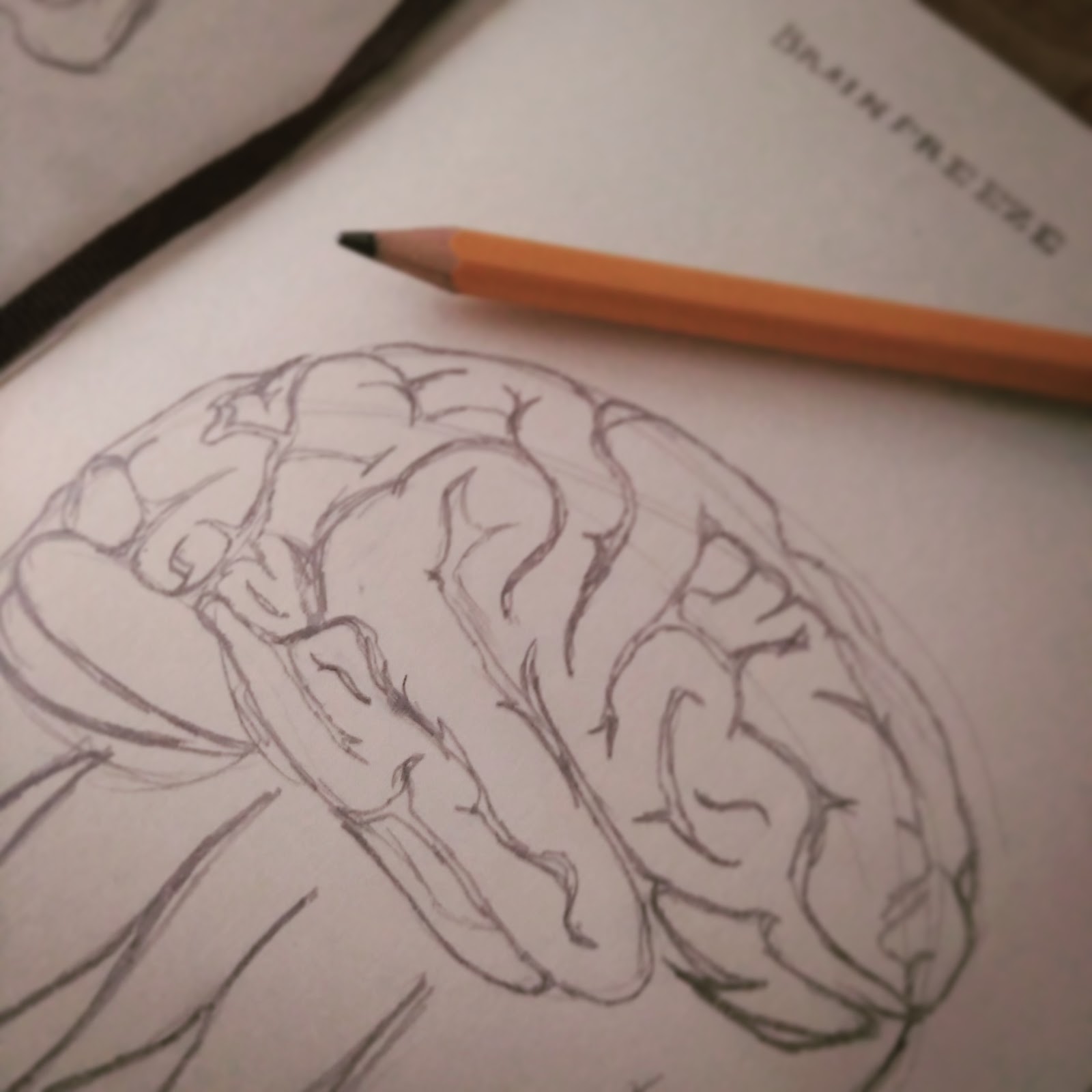
Brainfreeze

Closeup

"...so little time."

Part 2!  Last week I shared Heartburn, which was an illustration inspired by my usual reaction to new experiences, ideas, and possibilities. This week, I'm sharing Brainfreeze... the aftermath of that.

Initial Sketch

Brainfreeze is essentially what happens when Heartburn burns out, and it represents my indecision. I'm thankful that I've found so many wonderful things that make me excited, but there is a cost in being passionate and enthusiastic about so many things. It's tough to make decisions. I find it difficult to decide if I want to follow this wonderful rabbit hole of an idea or that one. I stress out a lot; because I know that choosing this means saying no to that. You can do anything, but not everything, and all that jazz. Ultimately, decisiveness is something I'm trying to work on.


I designed these two illustrations together; to show my thought process. I don't know if anyone will see elements of themselves in them, but at the very least I hope you lovely people think they look cool. :)


Tuesday, 22 September 2015

Heartburn

Closeup

"So many ideas..."

Part 1 of 2! The idea for these illustrations first hit me back in February-ish, but for one reason or another, I haven't had the chance to really bring them to life until recently. They're nearly more relevant now than they were then though, considering the incredible summer I've had, and all the decisions that I've had to make in the past few weeks in particular. I'm incredibly thankful, and overwhelmingly excited about everything that's been happening in my little corner of the world lately; and this little drawing sums up that feeling pretty well.

Initial Sketch

Heartburn - I'm a sucker for a pun, and visual puns are even better! - represents my excitable side. If you know me in person at all, you'll know that I'm essentially a storm in a teacup... If I like something, I tend develop an all-out obsession with it, so I throw myself at projects or ideas or stories with a passion and enthusiasm that sometimes surprises people. It's fun, it's fast, and usually it means I produce work that I'm proud of.

Full Image

That's just one half of the story though. I'll share Part 2 next week! ;)

Tuesday, 7 July 2015

The Battle


Weeks ago, before I headed off to Catalunya, I drew two of my favourite MotoGP riders - Marquez and Rossi - battling for a win. Originally intended to be a doodle/a test/me playing around, I never felt the need to share it. After the events of the Dutch GP at Assen, though, I couldn't help but revisit! That last lap battle between these two guys? Amazing.

I didn't really know what I was going for at any stage, but I had the style I used here in mind.. Here's a breakdown of me playing around escalating into something more.* 

Original drawing with pen on paper. Finished off on the plane.
Messed up the lineart in Photoshop. Added lights and darks with line and tone.
Added colour.
Adjustment layers to add a little oomph. Et voila!


Tuesday, 10 March 2015

Emily | Portrait


Here's another assignment from last semester: a digitally painted portrait. Once again, the wonderfully willing Emily (actress) helped me out by becoming my model. There's a chance you'll remember her from past projects, including Race Against Time and The White Lady of Kinsale. I actually asked Emily to help me with this one in particular for a number of reasons, which influenced the overall look of this project.

Firstly, we met in secondary school, where we took art classes together. At that stage, Emily occasionally tried her hand at painting, and frequently leaned towards more abstract looks. For this reason, I built the portrait on a background of acrylic-style brushstrokes. I picked the sepia colour because Emily, like me, has a fondness for all things vintage (especially old film-memorabilia, I think), so I wanted to capture an old-film kind of look. I also added gold because Emily is always classy and elegant, so it seemed fitting. I also appreciated the connection to film awards such as the Golden Globes, which is another link to Emily's personality.

Emily's personality and our shared interests also influenced smaller details within the image. In school, we were always hopelessly ambitious (we still are, to be honest) and it was her ambition to become a part of the acting world, for instance, which inspired the film reel border. Because she is a self-professed coffee-connoisseur and tea-lover - and the fact that when we meet, either coffee or tea are generally involved at some stage - I added the coffee stains to the background. Finally, I added some French phrases in a scripted font for a few reasons. Emily and I shared language classes for many years, and we both share a love of travel. Emily, I believe, is particularly partial to capital cities, like London and Paris. We also both share a tendency to use elaborate handwriting wherever possible. And finally, Emily has a very distinctive way of speaking, which is usually pretty entertaining, so I wanted to include language in some way.

And so, the portrait above is a result inspired by the ever-lovely Emily (actress), to whom I am so, so grateful for! Below, you can see the original photograph I took of Emily for reference in all her Irish-sun-drenched glory.

Tuesday, 24 February 2015

Photography | Tones

Last semester, I also studied a photography module, which was something completely new for me. Yes, I have taken photos before, but I had never taken the time to really get to know how to use a DSLR to its full potential. So, photography class was a bit of a learning curve, and its a skill I would love to develop further. These shots were taken for a photography assignment in the past few months. Click to embiggen them!