Showing posts with label illustration. Show all posts

Tuesday, 29 September 2015

Brainfreeze

Closeup

"...so little time."

Part 2!  Last week I shared Heartburn, which was an illustration inspired by my usual reaction to new experiences, ideas, and possibilities. This week, I'm sharing Brainfreeze... the aftermath of that.

Initial Sketch

Brainfreeze is essentially what happens when Heartburn burns out, and it represents my indecision. I'm thankful that I've found so many wonderful things that make me excited, but there is a cost in being passionate and enthusiastic about so many things. It's tough to make decisions. I find it difficult to decide if I want to follow this wonderful rabbit hole of an idea or that one. I stress out a lot; because I know that choosing this means saying no to that. You can do anything, but not everything, and all that jazz. Ultimately, decisiveness is something I'm trying to work on.


I designed these two illustrations together; to show my thought process. I don't know if anyone will see elements of themselves in them, but at the very least I hope you lovely people think they look cool. :)


Tuesday, 22 September 2015

Heartburn

Closeup

"So many ideas..."

Part 1 of 2! The idea for these illustrations first hit me back in February-ish, but for one reason or another, I haven't had the chance to really bring them to life until recently. They're nearly more relevant now than they were then though, considering the incredible summer I've had, and all the decisions that I've had to make in the past few weeks in particular. I'm incredibly thankful, and overwhelmingly excited about everything that's been happening in my little corner of the world lately; and this little drawing sums up that feeling pretty well.

Initial Sketch

Heartburn - I'm a sucker for a pun, and visual puns are even better! - represents my excitable side. If you know me in person at all, you'll know that I'm essentially a storm in a teacup... If I like something, I tend develop an all-out obsession with it, so I throw myself at projects or ideas or stories with a passion and enthusiasm that sometimes surprises people. It's fun, it's fast, and usually it means I produce work that I'm proud of.

Full Image

That's just one half of the story though. I'll share Part 2 next week! ;)

Tuesday, 8 September 2015

Illustration | Sir Arthur Conan Doyle


Back in June, I got a message to ask if I'd be interested in doing some design work with Lightning Strike Comics, for a charity comic book called The Life and Adventures of Sherlock Holmes. Obviously, I was absolutely delighted to jump on board as a collaborator, alongside some really incredible artists and writers. I also provided an illustrated portrait of Sir Arthur Conan Doyle, and arranged the text and logo placement on the front cover of the comic. I shared a tiny glance of the design work in this post (hopefully I'll show the design work in full here soon!) but today I wanted to share the portrait! I'm pretty happy with how it turned out!


Because the whole book was based on the very popular stories of Sherlock Holmes, I wanted to keep a slightly "vintage" and slightly "worn out" tone, and because I was illustrating a writer, I decided to bring in some inky, papery textures too. Compositionally, it was suggested that I arrange the illustration to appear in an oval frame, which is how it appeared in the final printed copy of the book.


Overall, I'm pretty happy with how the portrait turned out, and to have my name in a comic book for the first time... I'm still smiling about that!

Tuesday, 1 September 2015

Caravan Palace


I'm moving back to Clonmel for college this weekend, this is technically my last post of the "summer." and I went swing dancing for the first time last week; so it's couldn't be a better time to share a Caravan Palace! (Note: This illustration is available as a print here. :) )

Can you believe it's September? I can't. This summer was such an incredible one, and the time has absolutely flown by! I still can't believe that in less than a week I'll be back in classes and lectures. And this year is going to be different in many ways. For a start; I'm going to be living on my own this semester! I'm moving into a tiny little house on Friday, although I still legitimately think I'd have been better off buying a little caravan and living in that instead.


Buying a caravan and doing it up into something cool and quirky and weird, and touring around Ireland or Europe or somewhere (anywhere), is something that I'd love to do at some stage. It's my idea of a perfect summer really; driving around a country or continent, discovering new places and new experiences. A little caravan palace? That's the dream!

Which brings me on to swing dancing! It's something that I've been wanting to try out for a really long time, and last week I actually managed to find a class and take it! Caravan Palace - a swing band - is one of my favourites (I fully intend to see them perform live someday! Just look at the video above! Incredible stuff!) and because I'm a former gymnast, I really missed dancing. So I took the class, had some fun, and I've been listening to Caravan Palace since.


Ultimately, this post feels like I'm about to head back into the routine. Ballpoint pen in my Moleskine sketchbook; it feels good, and familiar, and welcoming. Tomorrow, I'll have my last full day at work (the photo above was taken on my lunch break this afternoon - I've gone to that bench in that park most days this summer), I'll take a day or two to take a step back and breathe, and then I'll kick off next week in full swing!Till then!


Tuesday, 18 August 2015

Liar, Liar


Pants on Fire. Your nose is longer than a telephone wire.

I recently got talking with someone about the best films we've ever seen; and I reckon I will always put Lock, Stock, and Two Smoking Barrels at the top of that list. It's got good, solid, characters, the use of the English language is off-the-wall, and it's one of the best-told stories I have ever come across. No matter how many times I've seen it; it still makes me laugh, makes me frustrated, and makes me excited to see what happens next. Classic British comedy at it's finest.


It's also a very, very well directed film (hats off to you, Mr Guy Ritchie!), so there were a LOT of shots that I wanted to illustrate. Alas, the week was busy, so I could only pick one. So, here's Tommy, during the boxing-ring poker game that sets the ball in motion.


I'm pretty happy with how this turned out overall. Wish I could spend more time on it, but between day-job, odd-jobs, and freelancey-design-jobs, I was lucky I was able to spend the few hours on this at all. I might return to Lock Stock for more inspiration in the not-too-distant future though; 'cause I had a lot of fun with it. And  it's a pretty good excuse to listen to the soundtrack and watch my favourite film all over again. And with scenes like this:


How could you not love it?:)

Tuesday, 11 August 2015

Dublin Comic Con 2015

Super-quick, day-job-break-time doodle of a buddy who was there in Cosplay. As soon as I can get a link to Aaron's stuff online, I'll be sure to share it - he's done some pretty incredible costume work.
A massive thank you to all of the incredible writers, artists, cosplayers and friends who I was able to chat with (however briefly!) at Dublin Comic Con last weekend. Seeing my name in the credits of a comic book for the first time was a pretty incredible feeling, and I came away feeling ever more inspired and enthusiastic about comics and art and stories! Special thanks in particular to Eoin and the rest at the Lightning Strike Comics table for making me feel so welcome!

A hint at one of the pages I got to design. Almost all the textures I used were from papers from around the time the original Holmes stories were written, with a few illustrations and stains scattered throughout. SO much fun to work on!

A huge thank you too, to all those who contributed to The Life and Times of Sherlock Holmes, and to everyone who picked up a copy! We raised over €1000 to be donated to children's hospitals in Dublin, which makes a book that was great anyway, just that little bit greater! I really was delighted to be a part of it, and hopefully more projects like this will come up in the future.

My haul from the weekend! They're all SO beautiful, and the ones I've read so far have been utterly brilliant! 

Embarrassing enough as it is to admit; this was the first time I've ever been to Dublin Comic Con. I really can't recommend the trip enough; there was so much talent under that roof over the weekend that it could have gone on for a week and I'd still be learning something new at the end of it. The stalls, the cosplays, the panels, the Q & As, there was just so much brilliance to take in that it was nearly overwhelming! Can't wait for the next one! 

Tuesday, 4 August 2015

The Chicken Song | Update 01


I am incredibly excited about this project, and really couldn't wait to share it! Recently, I was approached by Ruth Butler to animate a music video for a song she had written. I'm about two weeks into this ten week project, and I'm happy to say that things are going very well. Ruth has a brilliant sense of humour and a clever way with words, which all poured into this quirky, entertaining little tale about a chicken and a golden egg.


Because the song is such a fun story, because Ruth wanted the lyrics to appear on screen, and because I needed to animate to a high standard quickly, I thought styling it like a comic book would be the best route to take. So saying, I'm looking forward to seeing the final result, and because I've designed everything according to both US Comic Book Dimensions, and HDTV, the story will look good in print as well as on screen when it's finished.


This is just one page in this little story, but there's a lot more to come that I'm very much looking forward to showing you!

PS: If you think that you, or someone you know, would have a good voice to sing a song like this, get in touch at allie22 (at) gmail.com! :)


Tuesday, 21 July 2015

Illustration | Harley Quinn


A pretty vibrant character with a healthy dose of attitude; it's gotta be Harley Quinn. The trailer looks promising, no?


Digital painting is something I've admired from a distance for a long time, but never really felt hugely confident with myself. Nevertheless, it's one of my favourite ways to colour, and it's a skill I really want to develop, so I've decided to embrace the challenge. I've just partnered up on a really fun comic/animation/music video project too (can't wait to share the details here, but you'll have to wait a while!) so I figured I could do with a colour study anyway.


Harley is a character I wish I'd come up with. She's a lot of fun to draw, so I keep coming back to her when I'm trying out different styles and whatnot. I shared a few of those sketches below.

Sketched during down-time at work (I only had a refill pad).

Quick pin-up style, inspired by one of the photos doing the rounds online.

Inspired by Geneviveft on Instagram.


Tuesday, 14 July 2015

Illustration | Mad Max : Fury Road | The Nux Car


Mad Max : Fury Road. Have you seen it? Did you love it? Can you guess my favourite character? As always click to enlarge the images; both images below are desktop wallpapers. ;)


This was a fun learning curve. It started life in pen on paper, then I painted it digitally. I made a few custom photoshop brushes for the mud splatters and whatnot, and used rust textures where I thought they'd work. Other than that, this was all layers, masks, adjustment layers, persistence, and time. Learning.

PS: I draw vehicles a lot. If you're interested; here's a smattering of links (some of which are to external sites, where you can buy prints and mugs and pillows and other fun stuff of particular designs):
Go look if you haven't seen 'em! 

Tuesday, 7 July 2015

The Battle


Weeks ago, before I headed off to Catalunya, I drew two of my favourite MotoGP riders - Marquez and Rossi - battling for a win. Originally intended to be a doodle/a test/me playing around, I never felt the need to share it. After the events of the Dutch GP at Assen, though, I couldn't help but revisit! That last lap battle between these two guys? Amazing.

I didn't really know what I was going for at any stage, but I had the style I used here in mind.. Here's a breakdown of me playing around escalating into something more.* 

Original drawing with pen on paper. Finished off on the plane.
Messed up the lineart in Photoshop. Added lights and darks with line and tone.
Added colour.
Adjustment layers to add a little oomph. Et voila!


Tuesday, 30 June 2015

The Little Black Book - Character Sketches


Click to enlarge it! 

A few weeks ago, I bought a little black sketchbook. I don't know what I intended to do with it originally, but it quickly became a little book of characters. They're generally quick sketches; usually around five or ten minutes, depending, and they're a lot of fun! Here's a collection of twenty-five of them. Some of them are completely original, some of them are characters I created for other projects, and some of them are inspired by or adapted from books or films or TV shows or art that I've come across.

Some of these characters have backstories, and a lot of them are calling out for colour, so you might see a few of them crop up again soon. I've got a lot of other fun projects in the works too, which I can't wait to share!


Tuesday, 19 May 2015

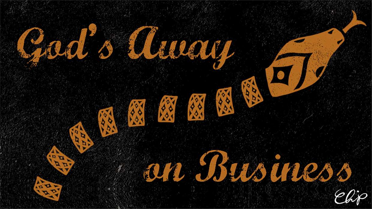
Kinetic Text | God's Away on Business


It's done! My kinetic text project is officially complete. So here it is! 


Please do click through to see the complete process, from start to finish! 

Tuesday, 5 May 2015

Layout Design | Atlantis


Atlantis again! This will probably be the last post I'll share about this project, for a while at least. The legend of Atlantis is one of my absolute favourite myths, though, so I'd love to revisit it at some point again. But for now, I'm going to leave you with a finished layout design for it. Click the image above to enlarge. 

Click through to see the a simple breakdown of the process.

Thursday, 16 April 2015

WIP 4 | Kinetic Text | God's Away on Business


The deadline for this kinetic text project is fast-approaching, and so are the deadlines for everything else! But it's pretty satisfying to see a big project like this one creep ever-closer to the finish line, so I'm pretty happy with it. There are still a few little bits and pieces about this section that I want to tidy up, but done is better than perfect, so right now, I'm planning to get everything finished to a standard I'm happy enough with, and then I'll go back over to tweak it to the best that it can be.

Tuesday, 7 April 2015

Ballpoint Pen Illustration | Origami


Remember: These illustrations and more is for sale on Society6. Check it out!

The other night, I took a playlist of delightfully questionable taste, a ballpoint pen, a Moleskine sketchbook, and two hours to illustrate this. It felt like I was coming home, and it felt SO good. Ballpoint pen is still my jam. I've missed it oh so much. I missed drawing just for myself, just to get a tiny snippet of my own thoughts out on paper. Click through to read more, and see the rest of this mini collection!

Tuesday, 17 March 2015

WIP | Atlantis | Character and Environment Design


Recently in college, we were tasked with pulling together a design package for a story based on "My Irish Myth." We were given the choice of working on a story that we're creating in groups (more on this later) or a new story of our own choice. I decided to go with a new story; The Lost City of Atlantis. It's not a "traditional" Irish myth, certainly, but there are some people who believe the city of Atlantis sank off the coast of the Emerald Isle, it's one of the best known myths globally, and it's one of my personal favourite legends, so I thought it suited the theme. At this stage, it's very much still a work in progress, but I'm having a bit of fun with it, and because it's St Patrick's Day, I wanted to write about something at least vaguely influenced by my culture. And so, today, I want to introduce to you the first character I've designed for the The Lost City of Atlantis (but with an Irish twang). 


This character is called Síofra (she-o-fra), which means elf or sprite. I'm still fleshing out the real spirit of her character, but at the moment at least, she's a mischievous Atlantean who likes to explore the world around her. 


And this is the first background layout I've drawn up; Síofra's house. Located in a cliff-edge environment, but with a distinct Irish style, the house sits on it's own tiny island and is reached only by a wood and rope bridge. 

Finally, I just want to say, Lá Fhéile Phádraig! Hope everyone's having a good St Patrick's Day! :)

WIP 3 | Kinetic Text | God's Away on Business


I've been feeling a little unwell for the past while, and it's been a struggle trying to balance college work, appointments for this that and the other, and general life. It's funny which projects become more difficult to manage... This kinetic text project is one of the more complicated projects I've got in the pipeline, but it's one of the only projects I seem to be able to wrap my head around lately. Hmm...


Anyway, here's a little update on the project so far! I'm having fun with it!
(Sorry for the kinda terrible quality though!)


Thursday, 12 March 2015

If You Have Enough Book Space | Terry Pratchett


Terry Pratchett...


I started reading Discworld when I was around twelve years old, and while that series instantly became one of my favourite collections of novels, Pratchett immediately became my favourite author. The characters, the worlds, the stories that Pratchett created and showed to his readers were incredible. His creativity, imagination, and wit have always inspired and delighted me, and his quirky, ever-positive outlook on life, and death, and everything in between are so mind-bogglingly brilliant that that they consistently leave me in awe. The more I read, the more I learn, and the more I appreciate the wisdom and intelligence of Pratchett’s view of our world.  And so, more than just an author, but as a human being; Terry Pratchett will be missed. Quite terribly. 

Wednesday, 29 October 2014

Don't Starve - Wednesday


Have any of you played the PC game, Don't Starve, by Klei Entertainment? If you haven't, you should! One of my assignments in college this term was to create a new character to be placed within an existing universe, and while some of my friends picked things like Adventure Time and Valiant Hearts, I picked Don't Starve. And I am so glad that I did!

So the first step in the process was research, research, research. I studied the game itself, paying attention to the the line weight, the colours, the shapes, and everything in between. I made some interesting discoveries that I might not otherwise have picked up on; almost every character in the game wears red, for example, and the males only have pupils, while the females only have whites in their eyes. The playable characters, as a set, are incredibly unified, right down to their names: almost all of them start with the letter W.


I also researched different types of characters that I might like to design; and eventually settled on a Horologist, whom I named Wednesday*. Then I was able to sketch out some ideas (throwing away most of them!) and eventually figured out how I wanted my character to look. Below, you can see how I drastically I changed the character from the original sketch into the final lineart.


The next step was colouring, which was a LOT of fun! We were taught a technique of colouring that I had never used before, which allowed for easy changes later on. It worked out quite well, I think! I experimented with different hues and things, but nevertheless I stayed true to the game's styling, and went with a predominantly red colour scheme, with a lot of black scribble detail.


The final part of the assignment was to place the character in different lighting situations, which was my favourite part, by far! We were given five different themes: 01) Mid-day sun 02) Dark rainy day 03) Moonlight 04) Sunrise 05) Haunted House. We weren't asked to design the backgrounds, per se, but I got a little carried away with them... 


Overall, I'm pretty happy with the end results. What do you think? Does my character fit in with Don't Starve? Do you have a favourite lighting condition?


*In honour of Wednesday Addams, whom I love, and think would fit in with the game perfectly! I also watched The Addams Family recently and remembered how much I loved it all over again.