Tuesday 28 July 2015

Logo Design | Ortús Chamber Music Festival


Ortús Logo by OneCuriousChip
Final Logo Design
Very excited about this project! Back in June, a friend of mine - super talented cellist, Sinéad O Halloran - approached me about an idea she had. Together with Mairead Hickey, she plans to launch a brand new chamber music festival, called Ortús, which will be based in East Cork in February 2016. It was an absolute pleasure for me to get involved by designing a logo for the event!
Very loose and sketchy initial thoughts.

After discussing the project with Sinéad, I learned that the name of this festival - Ortús, pronounced "ore-toose" rhyming with moose - originates from two words; the latin word, ortus, meaning rising, beginnings, origin; and the Irish word tús which means beginning, start. The overall idea of the festival is to encourage young Irish musicians who have studied and performed abroad to come home and share what they've learned from their experiences with our local communities. Three concerts are planned, as well as open rehearsals, and outreach in schools. With all of this, Ortús really wants to make chamber music more accessible to the public, and hopefully inspire the next generation of musicians to broaden their horizons too. 
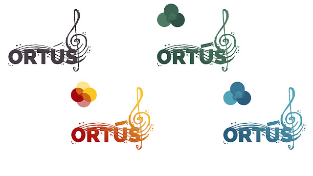
Colour studies.
With all this in mind, I began drawing up sketches in various styles and colours. I considered a wide range of symbols; inspired by everything from the passion that these musicians had for their craft and the cultural significance of returning home to share their experiences, to the dawning of their careers and the idea of crossing oceans and moving mountains with their talents. I also considered more physical elements of the project; including elements of string instruments and music notes, as well as waves of the ocean and the colours of the sea and land. 
Ortús Logo Design by OneCuriousChip
Final design.

After various experiments and revisions, the final design that we came up with was this. Encompassing the idea of crossing oceans, and returning to the island of Ireland, I included waves and 'bubbles' in a deep blue design. I also used four "strings" to represent both the instruments that will be played during the festival, as well as the sheet music the musicians will play according to.  The curving shapes were inspired by the scroll at the top of those instruments, as well as the treble clef used in sheet music, and the fluid motion of music as its played- both in the sound, and in the musician themselves, as they pull the bow across the strings.
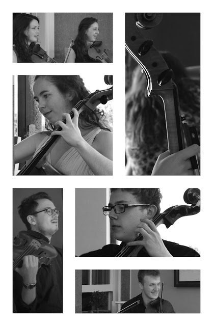
Ortús Musician photography by OneCuriousChip
A few photos I took of the musicians involved.
Sinéad was also kind enough to let me tag along during a photoshoot at the end of June, which gave me the opportunity to meet with the musicians involved, take a few photos, and listen to them play. They're impressive, to say the least! I can't wait to see them perform again next February, and I'll share details as the event approaches on my social feeds, because I think you might like to see them perform too!

Taken while I was waiting around on the day of the photoshoot.

I was also fortunate enough to meet with Richard from Creative Productions, as he recorded a promotional video on the day, and with Bríd O Donovan, who handled photography.  Go and like the Ortús Festival Facebook Page to keep up to date on all of the Ortús Festival details. It's gonna be good! 


Tuesday 21 July 2015

Illustration | Harley Quinn


A pretty vibrant character with a healthy dose of attitude; it's gotta be Harley Quinn. The trailer looks promising, no?


Digital painting is something I've admired from a distance for a long time, but never really felt hugely confident with myself. Nevertheless, it's one of my favourite ways to colour, and it's a skill I really want to develop, so I've decided to embrace the challenge. I've just partnered up on a really fun comic/animation/music video project too (can't wait to share the details here, but you'll have to wait a while!) so I figured I could do with a colour study anyway.


Harley is a character I wish I'd come up with. She's a lot of fun to draw, so I keep coming back to her when I'm trying out different styles and whatnot. I shared a few of those sketches below.

Sketched during down-time at work (I only had a refill pad).

Quick pin-up style, inspired by one of the photos doing the rounds online.

Inspired by Geneviveft on Instagram.


Tuesday 14 July 2015

Illustration | Mad Max : Fury Road | The Nux Car


Mad Max : Fury Road. Have you seen it? Did you love it? Can you guess my favourite character? As always click to enlarge the images; both images below are desktop wallpapers. ;)


This was a fun learning curve. It started life in pen on paper, then I painted it digitally. I made a few custom photoshop brushes for the mud splatters and whatnot, and used rust textures where I thought they'd work. Other than that, this was all layers, masks, adjustment layers, persistence, and time. Learning.

PS: I draw vehicles a lot. If you're interested; here's a smattering of links (some of which are to external sites, where you can buy prints and mugs and pillows and other fun stuff of particular designs):
Go look if you haven't seen 'em! 

Tuesday 7 July 2015

The Battle


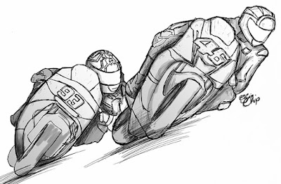
Weeks ago, before I headed off to Catalunya, I drew two of my favourite MotoGP riders - Marquez and Rossi - battling for a win. Originally intended to be a doodle/a test/me playing around, I never felt the need to share it. After the events of the Dutch GP at Assen, though, I couldn't help but revisit! That last lap battle between these two guys? Amazing.

I didn't really know what I was going for at any stage, but I had the style I used here in mind.. Here's a breakdown of me playing around escalating into something more.* 

Original drawing with pen on paper. Finished off on the plane.
Messed up the lineart in Photoshop. Added lights and darks with line and tone.
Added colour.
Adjustment layers to add a little oomph. Et voila!